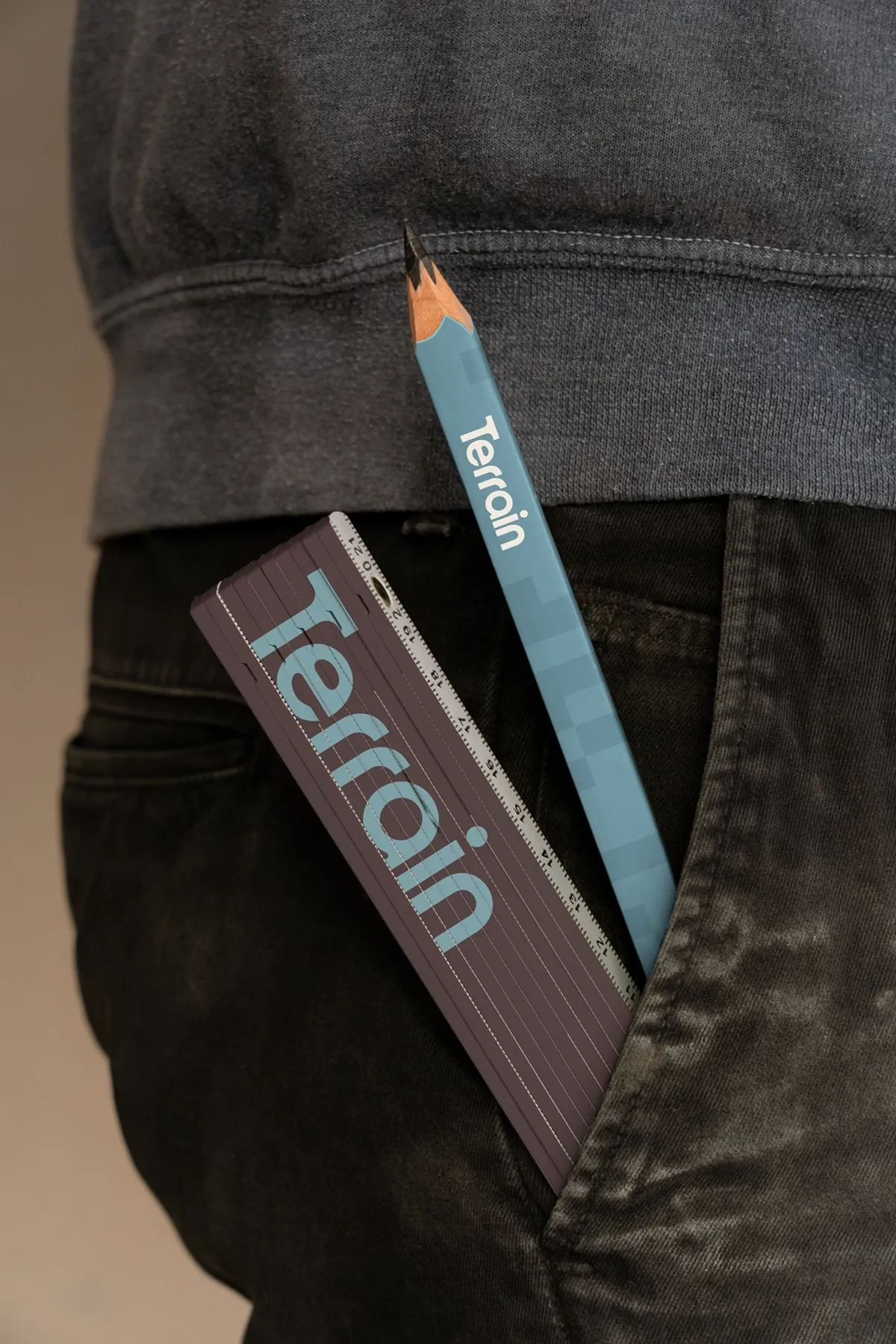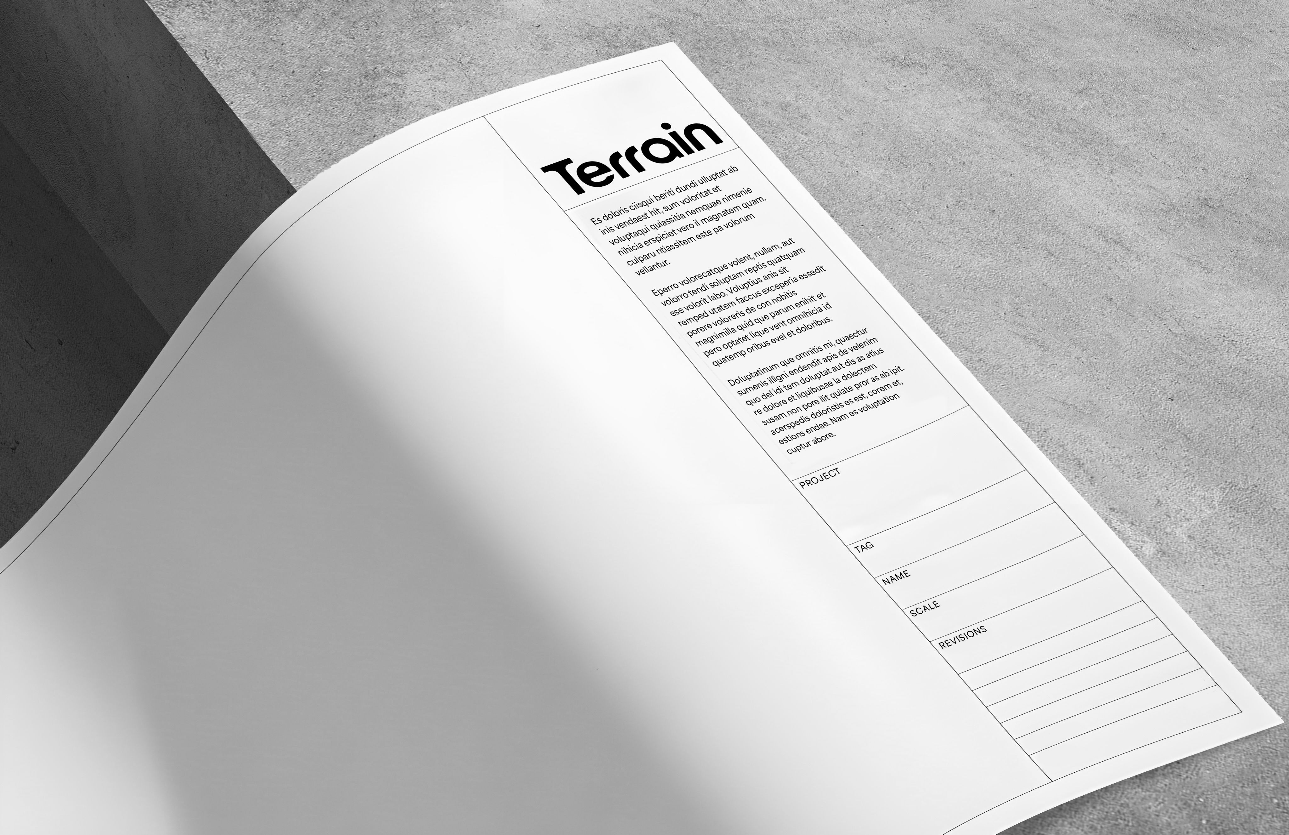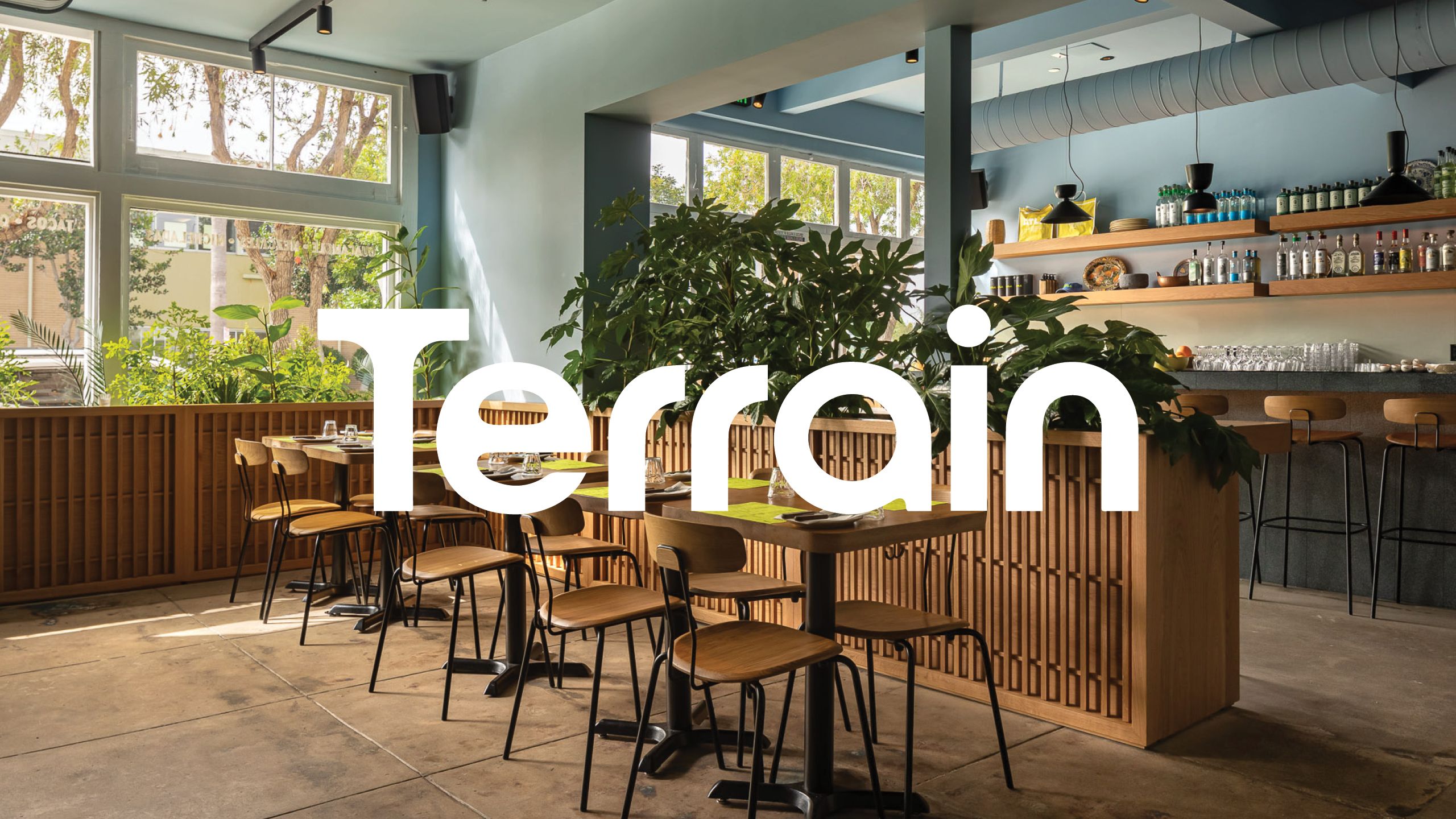
Terrain
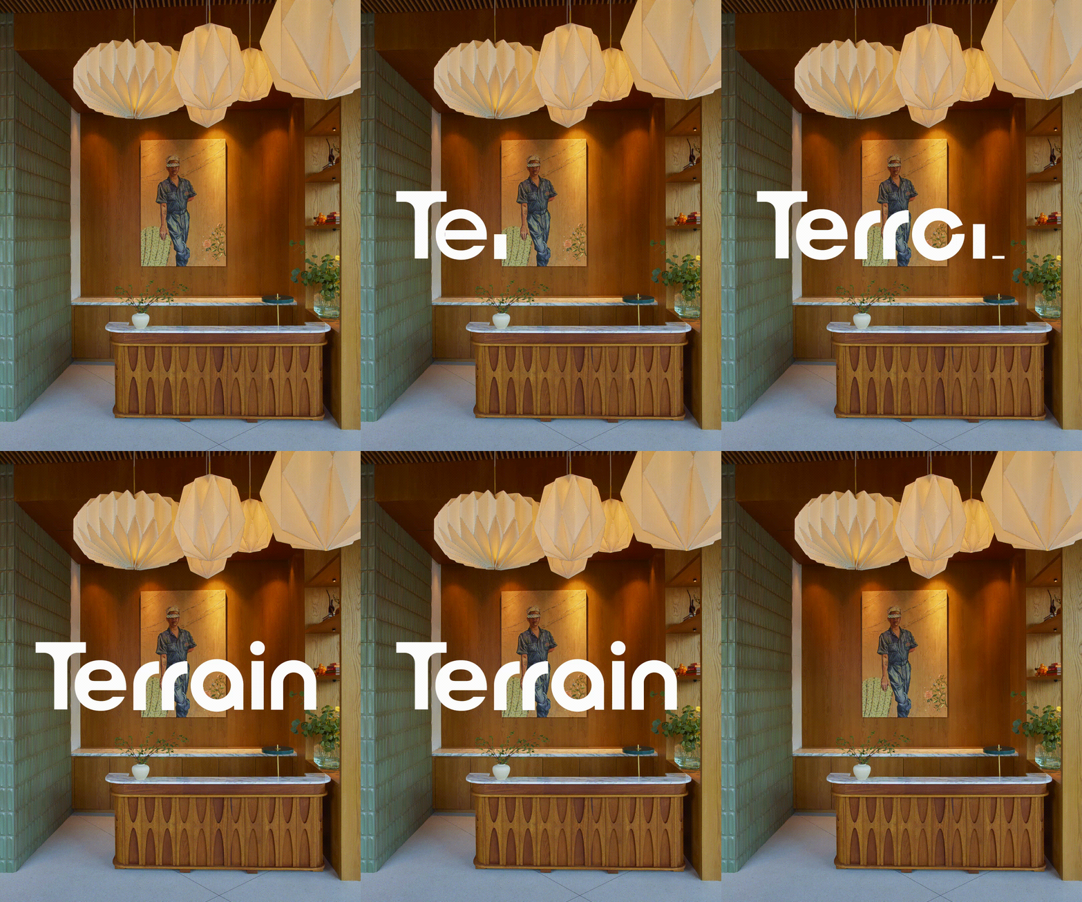
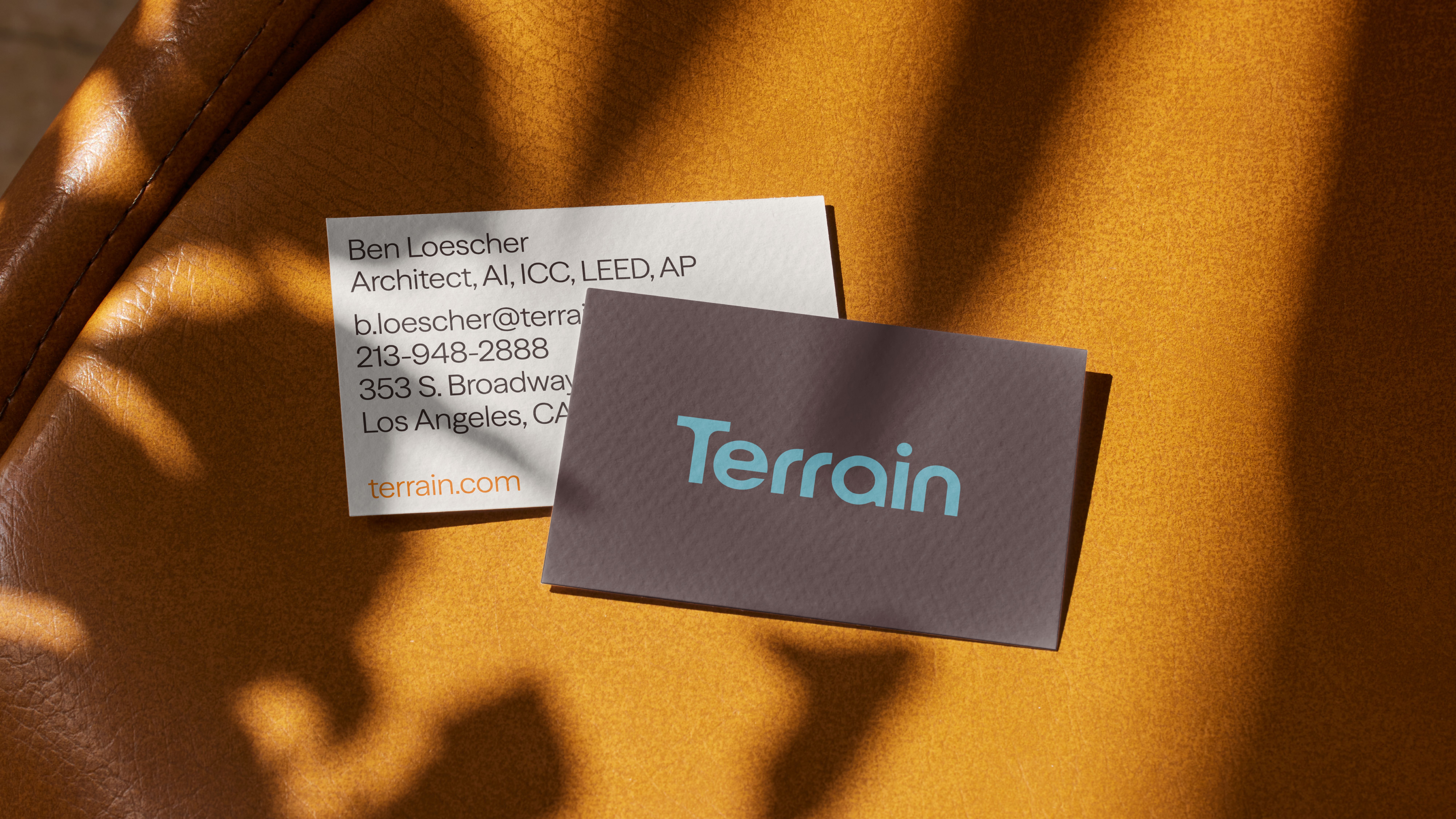
The identity expresses structured creativity through clarity, warmth, and momentum. Clean frameworks create confidence, while color and composition introduce energy and approachability.
At the center, the logo balances softness and precision, reflecting the belief that architecture is both human and solutions-driven. Its curves suggest optimism and collaboration, while its refined geometry signals clarity and discipline. Designed to feel collective rather than singular, it anchors a system that is intelligent, expressive, and quietly confident.
Color
The palette moves between stability and energy, mirroring Terrain’s approach: thoughtful frameworks paired with curiosity, warmth, and momentum. It’s a palette that feels alive; optimistic, approachable, and quietly confident.
Typography
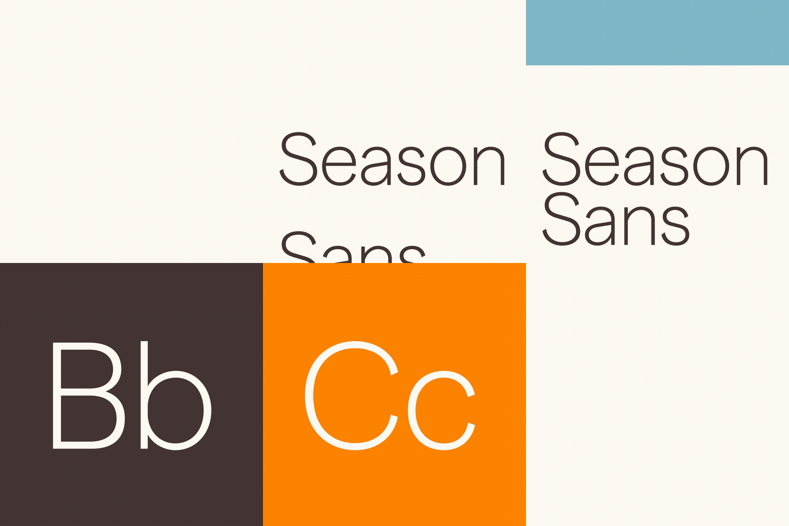
Season Sans was selected as the primary brand typeface. Clean and contemporary, with just enough character to leave an impression, it reinforces Terrain’s clarity of thought while maintaining warmth and personality.
The typography supports the work rather than competing with it, creating a confident, modern foundation that feels both professional and approachable.